Client — Maison et Lumiére
Interiors, Lights, Luxury
Brand Identity
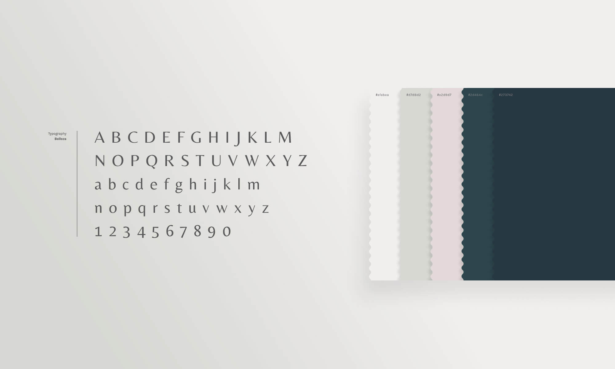
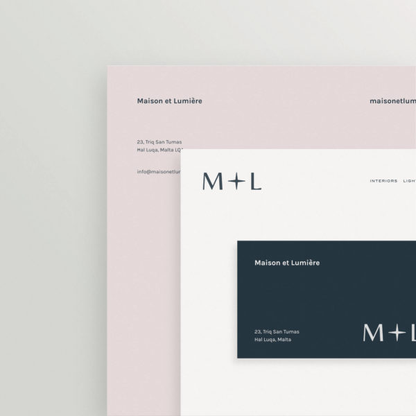
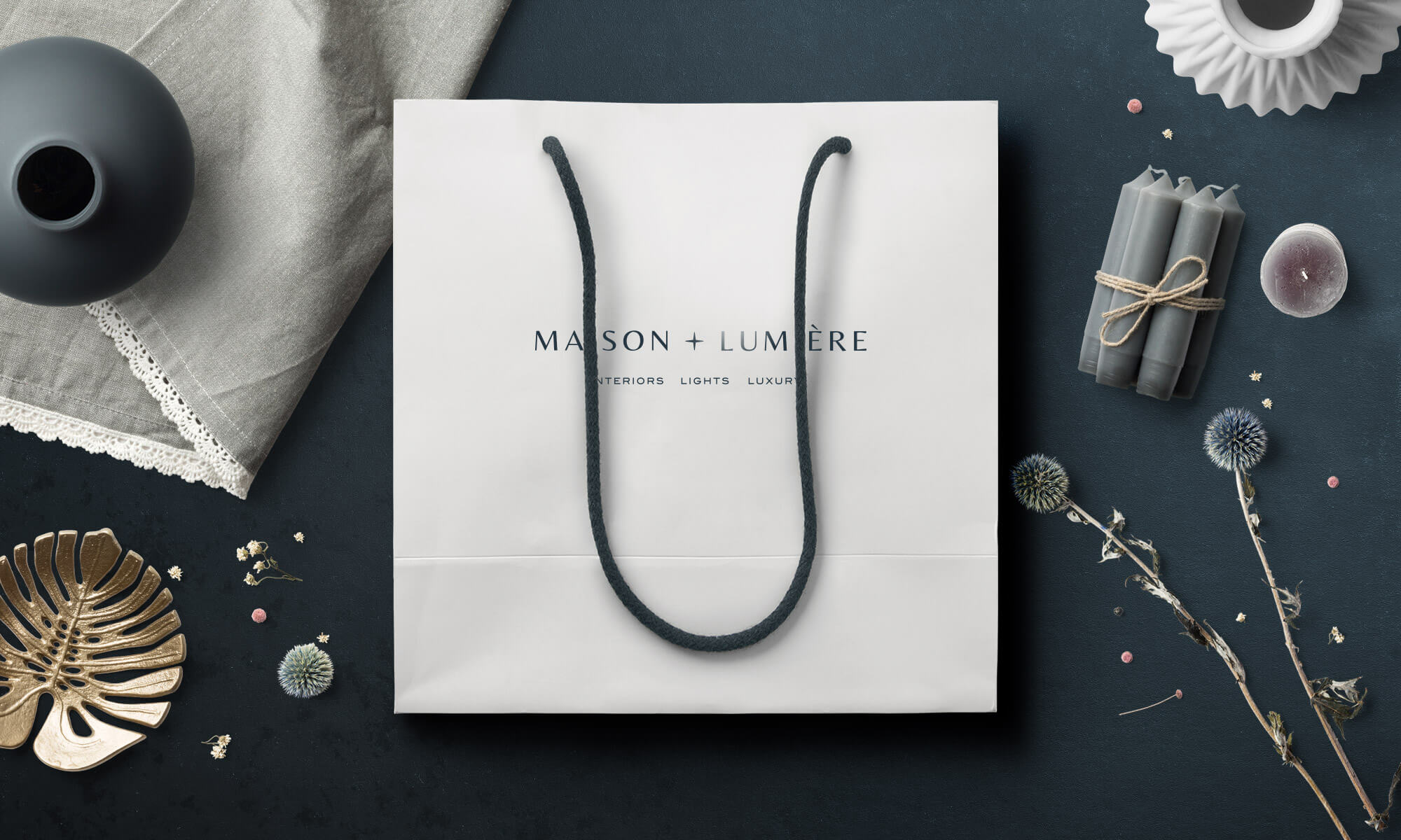
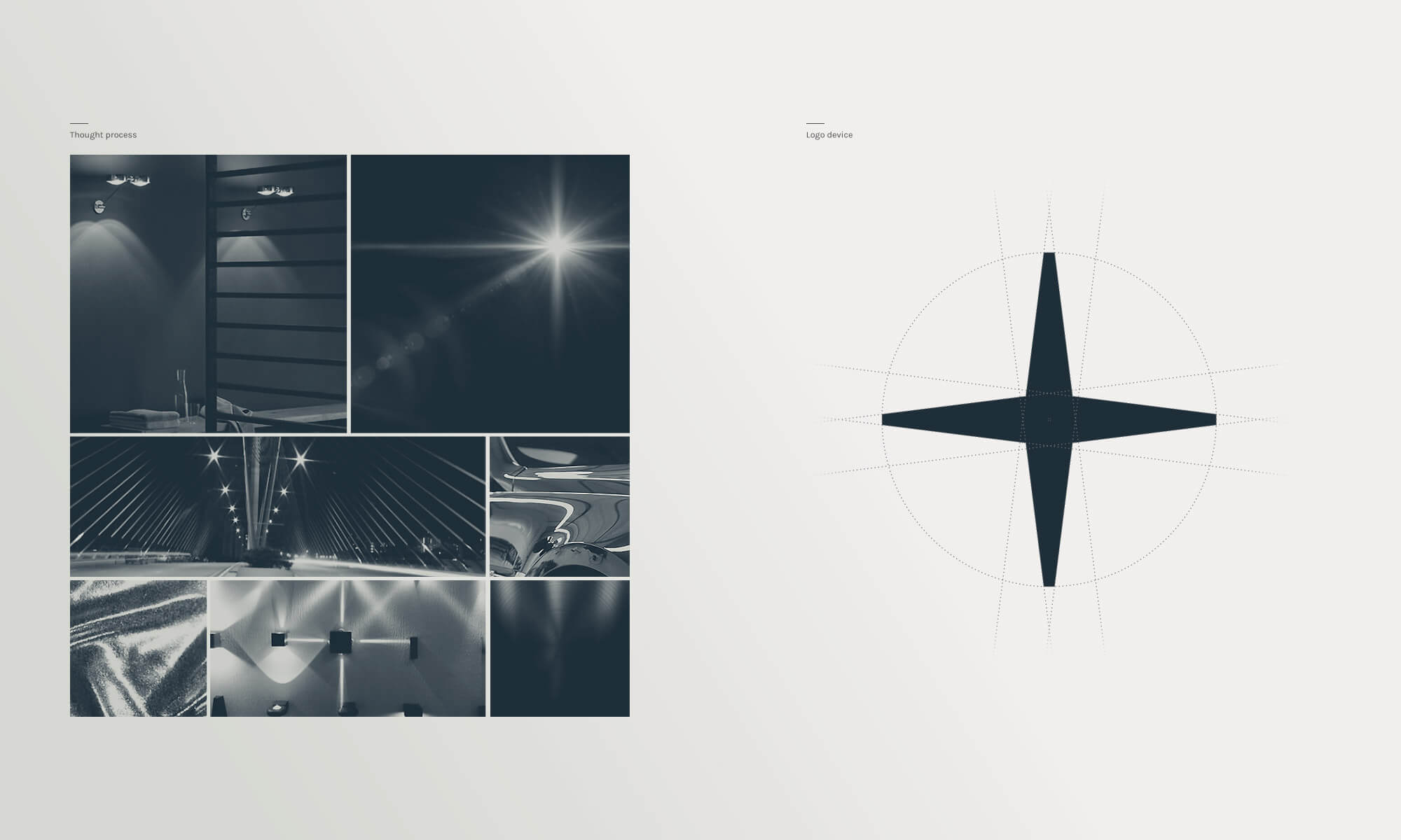
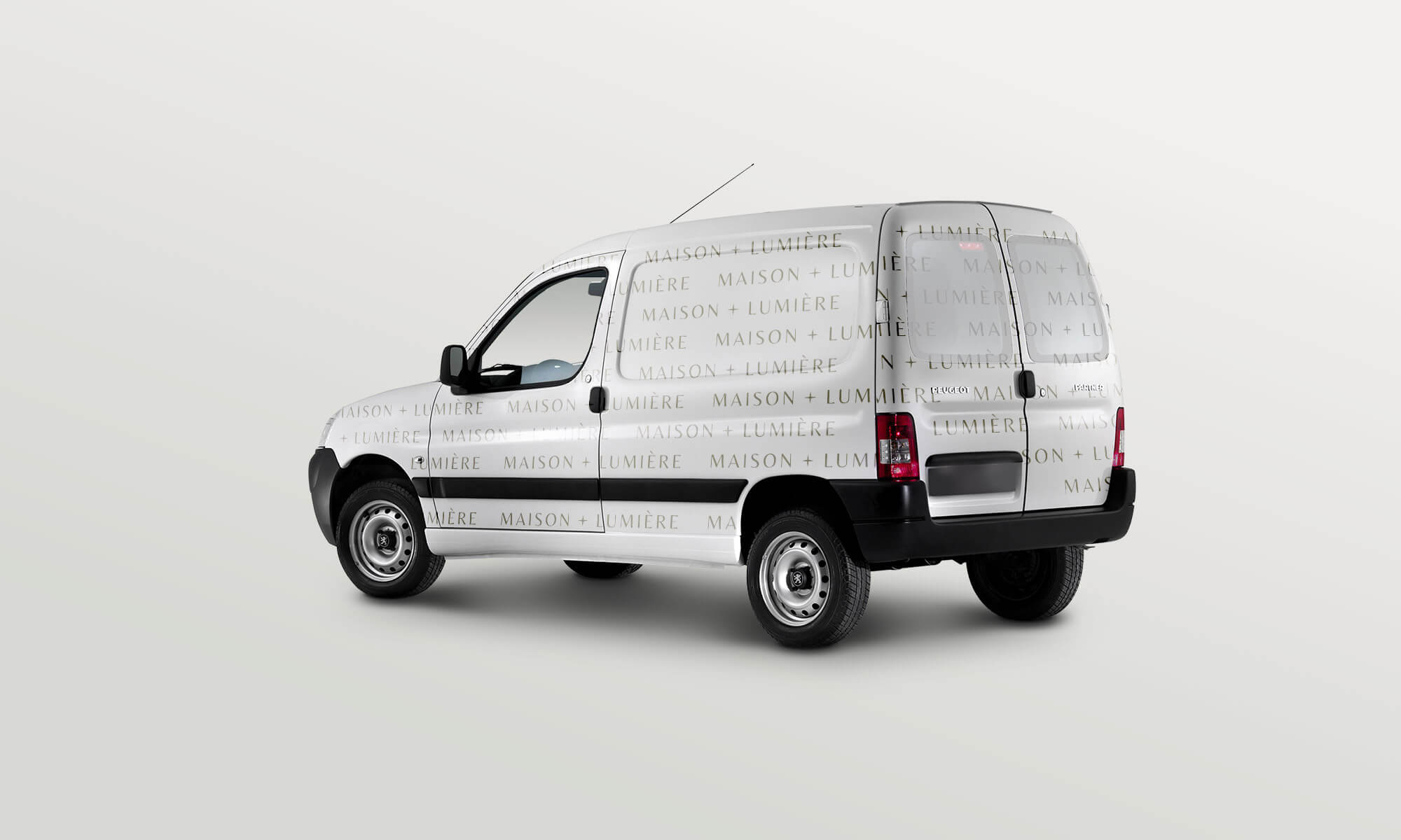
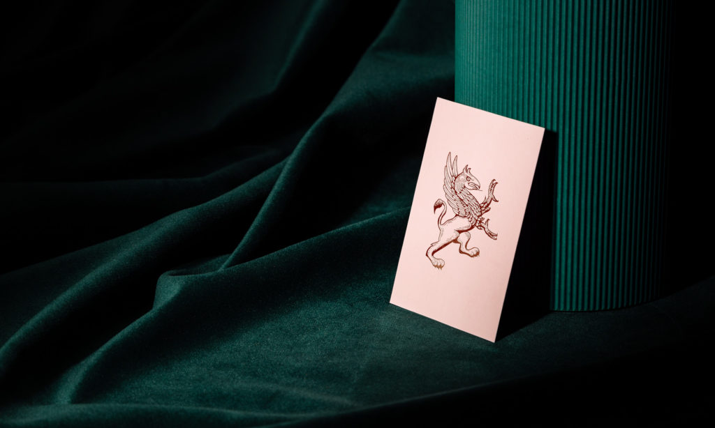
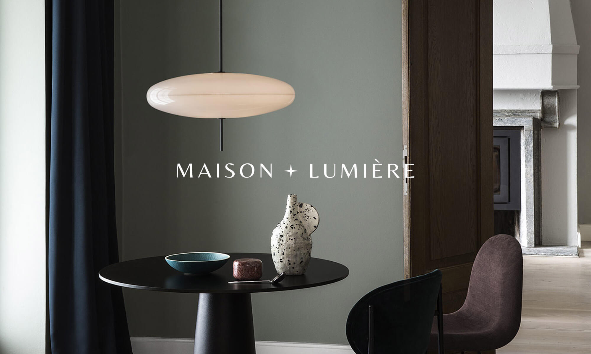
Inspired by light’s reflections, its interaction with spaces and materials, we created a geometrical symbol complementing the typeface. The result is a simple yet iconic mark. The wordmark, consisting of a hybrid serif and sans-serif typeface for this luxury interior and lighting brand, strikes a balance between the classical and contemporary collections carefully selected by Maison et Lumière. The velvety dark turquoise together with a spectrum of beautifully complementing pastel colours also help to accentuate this balance by introducing bold, dark tones paired with softer, lighter ones. A responsive version of the logo was created with the intention of being used in scenarios where space is limited, adding more to the brand’s supporting elements.
![](https://spn.mt/wp-content/uploads/2021/07/Maison-et-Lumiere-logo-full-portfolio.jpg)
![](https://spn.mt/wp-content/uploads/2021/07/Maison-et-Lumiere-typography-colour-palette-portfolio.jpg)
![Maison-et-Lumiere-stationery-stack-portfolio Maison-et-Lumiere-stationery-stack-portfolio](https://spn.mt/wp-content/uploads/2021/07/Maison-et-Lumiere-stationery-stack-portfolio-600x600.jpg)
![](https://spn.mt/wp-content/uploads/2017/08/Maison-et-Lumiere-light-interior-portfolio.jpg)
![](https://spn.mt/wp-content/uploads/2021/07/Maison-et-Lumiere-logo-on-bag-portfolio.jpg)
![](https://spn.mt/wp-content/uploads/2021/07/Maison-et-Lumiere-logo-inspiration-construction-portfolio.jpg)
![](https://spn.mt/wp-content/uploads/2021/07/Maison-et-Lumiere-products-portfolio.jpg)
![](https://spn.mt/wp-content/uploads/2021/07/Maison-et-Lumiere-van-portfolio.jpg)